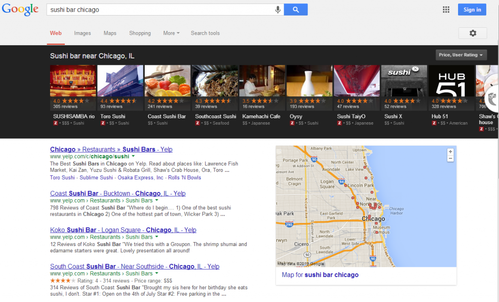
Continuing our post from Monday, here are some of the things Google is testing that appear to be in store for rollout in 2014 both on mobile and desktop. Make sure to read this excellent article by by Dr. Peter Myers for the Moz Blog in an article titled “Future SERP: a Glimpse at Google 2014“. This is a must read for all website owners.
4. Boxed design with expanded information for the top search result in the organic listings. Google is actively testing these results now. See the image above, this was taken when I did a recent search for Sushi Bar Chicago. Although I did not see the box design as noted in the article, what I did see was a new black bar across the top with reviews from Google+ Local pages and Zagut (Google’s new review property) plus a large map on the right with points detailed in the search results. The black bar is an eye grabber. This is just another of the new layouts Google is testing that is not even mentioned in the article.
5. Google Now Cards. If you use search on your smartphone, you’ve already seen the Google cards. This is a button/boxed shaped section with personalized information that appears when you open Google mobile to do a search. You can customize these cards and Google also delivers location specific information in these spots based on your actual location. If you are using an Android phone, you’ve also seen that even if you turn WiFi off, Google is turning it back on to know your location at all times to deliver location related content.
Check back on Friday to see the last in this series of what to expect on Google in 2014.
