AdWords Conversions Move to the Mobile Space

Beautiful young woman talking on mobile phone
Smartphones are no longer a luxury but a necessity.

I manage a large number of AdWords accounts for clients in a wide and diverse sector of businesses. In the last two months I have seen very marked trend – that is the importance of mobile for lead conversions.

Of specific note is that for some clients, mobile has become their sole avenue for lead generation. For some, no longer do people take time to complete the contact form on their website, it is all click to call and with nearly all leads coming in via mobile activity.

Specifically, I see this activity on accounts that have a very strong location specificity; such as accounts for doctors, dentists, lawyers, and heating and air conditioning service providers. If the product you sell is relatively expensive, typically the desktop and tablet arena is still where most of your leads will come from, but for many mobile is REALLY ramping up.

What I’ve found is by installing website call tracking from AdWords on a website, we are getting a fuller view of how clients are using AdWords and how the client is getting lead conversions. I am finding that AdWords is driving a huge amount of call traffic for clients that we previously could not track. With this information, we are also finding out that a call versus an email conversion is now your consumers action preference.

I find that the way people use AdWords, perform research, and how leads are now generated has changed, and significantly so. Make sure that your website and your AdWords account is set up properly to take advantage of this strong emerging trend that is mobile driven. This is the future for AdWords not just a short term trend.

If you need a savvy AdWords account manager, who just also happens to be a Google Partner to help you ramp up your conversion activity, you’ll want to look over our service offerings today.

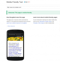
How Does Your Website Stack Up in the Mobile Space – Test It!

Screen Shot Showing the Results of the Google Mobile Friendly Testing Tool

Google continues to push and refine its message as to the importance all websites having a mobile friendly website. Just this past week on the mobile version of Google I started to see tags in front of search listings as to if the site was mobile friendly or not.

Truthfully, I believe the next step is for Google to filter out and not supply sites at all in the mobile search results that have not stepped up to create the proper mobile experience. I expect to see this happen within the next six months.

Google is serious about having a great experience for mobile users on their mobile search platform. If they do not, then users will migrate to other providers who show more relevant results. If they move, Google will lose big in the ad arena. So for Google showing the right mobile friendly results in mobile search directly equates with its own bottom-line. Miscalculate on how Google feels about mobile and you’ll be out of their index.

The great things is that Google moves slowly to make big changes like this, letting users know that they feel is important and provides tools to help site owners. Here is just one of the tools that Google has recently released: https://www.google.com/webmasters/tools/mobile-friendly/. It is an online tool to test just how friendly your website is.

Take the tool for a test drive to see just how your website stacks up. For now you have time to fix these problems, but you will not be able to wait forever. If you are using a legacy site, one that is not built with a responsive design and are not using a mobile rendering plugin or application to turn your old website into a mobile friendly one, you’ve just got to take action within the next six months to get there. We can help you get there. I invite you to review our responsive design options today to start on evaluating your options.


Don’t Block Google From Spidering Site Files

Google Partner Badge
McCord Web Services is a Google Partner.

Google has recently made some nice improvements in how and what it can spider to get a fuller picture of your website. By upgrading technology, no longer does their robot spider see the web in nearly a text version, but now almost as a browser sees the page.

As a result Google is letting webmasters know to not block spider access to CSS files, JavaScript, and image files. Read the full Google release on this subject.

Personally I think that Google is also looking for CSS for hidden text and other spammy and black hat uses but they are couching this “enhancement” as a way to provide “optimal indexing” of your website.

It has previously been common practice for webmasters to block search engine spiders from certain sections of their website using disallow in the robots.txt file in the root of a website’s hosting server, but Google clearly now wants to “see it all” and is instructing webmasters to not block their access.

There is still a place for considering blocking search engine robots using the robots.txt file in this fashion:

User-agent: *
Disallow: /folder-name/

One such case may be your draft file folder. If you work with a team and are doing page change drafts you may want to block those working files and old files so they do not get indexed in error.

Google’s Webmaster Mobile Usability

Image of a responsive website on multiple devices.
Make sure you set the viewport for your responsive website to display it properly on multiple devices.

Newly introduced into the Google Webmaster control panel is a new section found under “Search Traffic” called “Mobile Usability”. With Google flexing its muscles and readying to penalize websites that are not enhancing the mobile viewing experience your site may be getting flagged as not having the viewport configured.

In fact, if you are using WordPress plugins to render your blog or website as mobile friendly, you may need to manually add in a meta tag too stop Google from flagging this issue.

The viewport is a meta setting that helps a device determine how to display the content properly. Without a viewport setting your site can not render as you had expected. Visit this page online to see images where the viewport is set and is not. It is an eye-opener and once you see it, you’ll know why you MUST update your code to show the viewport properly. (Without the viewport set images may be small and the site may not fill the device screen properly. With the viewport set image that you had wanted to be full screen will be and your site rendered maximized for that specific device.)

Adding a meta tag to the head section of your code is easy. Just grab this snippet and install it using the Editor in WordPress or Dreamweaver on your responsive website.

<meta name=”viewport” content=”width=device-width, initial-scale=1.0, maximum-scale=1.0, user-scalable=no” />

Make sure you are using the code snippet that has the attributes separated with commas and not semi-colons. This little detail will assure maximum compatibility. Read this great article to find out why.